Layout Designer
Layout view turns a modular graph into a purpose-built effect panel. The goal is not to expose every parameter. The goal is to expose the controls that make the patch understandable and playable.
The screenshot below shows the same NoReelDelay front panel used in Operate view, but now in Layout mode. The green outer rectangle is the authored canvas boundary. The selected Ch_To_Delay control has resize handles, while the FRONT PANEL inspector on the right exposes the complete layout-authoring state.
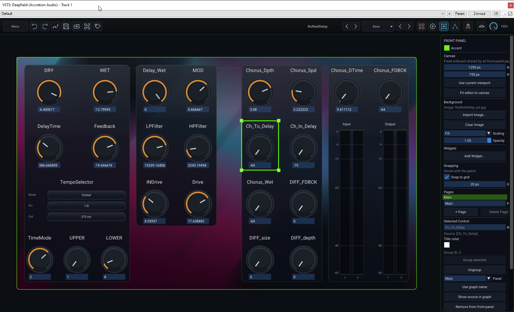
[!IMPORTANT] Storage: the authored front panel — canvas, pages, control positions/sizes, names, colours, grouping, widgets, background image and snapping settings — is portable
.p00tchcontent. Global rendering preferences such as Meaty / Flat / Flatter are saved globally instead and do not rewrite the patch. The DAW session also snapshots the live plugin state so the project can reopen exactly as left.
Operate and Layout share the same surface
Operate and Layout use the same front-panel coordinate system. Switching to Layout does not move the panel to a separate editor surface; it adds the boundaries, handles and inspector needed to design it.
This is intentional: what you arrange in Layout is what the user sees in Operate. Page changes also use the same fixed surface rather than stacking pages vertically and pushing the patch downward.
The Front Panel inspector
The inspector is divided into global panel controls followed by controls for the current page and current selection. It is worth learning because almost every visual property of a front panel can be authored without returning to the graph.
Accent
Accent sets the patch's front-panel accent colour. It is used by front-panel drawing where an accent is appropriate and lets a patch carry its own visual identity independently of the global rendering style.
Saved in:
.p00tch.
Canvas
The Canvas section defines the fixed artboard shared by every front-panel page.
- Width / Height set the authored size in pixels.
- Use current viewport copies the currently visible front-panel viewport size into the canvas dimensions.
- Fit editor to canvas resizes the plugin window around the existing canvas; it does not change the canvas itself.
A larger canvas can scroll inside a smaller plugin window, so changing the editor size is not the same operation as changing the authored panel size.
Saved in: canvas Width/Height are
.p00tchcontent. Editor window sizes are remembered in DAW/session UI state while you work; when you explicitly save a.p00tch, Deepfield also records the current Operate/Layout/Edit Graph editor sizes as portable patch presentation data. Fit editor to canvas itself is an action, not a separate stored switch.
Background
The Background section controls an optional image behind all front-panel controls.
- Import Image... embeds an image asset into the front-panel document.
- Clear Image removes the current background and any now-unused embedded asset.
- Scaling chooses Fill, Fit, Stretch, or Center.
- Opacity blends the image against the normal panel background.
The background belongs to the patch rather than referring to an arbitrary external path, so a shared patch can carry its appearance with it. Deepfield embeds the image directly and rejects background assets larger than 8 MB.
Saved in:
.p00tch, including the embedded background image and its scaling/opacity.
Widgets
Add Widget... adds panel-native elements that do not need a graph control node:
- Text Block
- Group Divider
- Input Meter
- Output Meter
Graph-linked controls are added separately through Add selected graph control(s) or the corresponding graph/front-panel command.
Saved in:
.p00tch.
Snapping
The Snapping section affects panel editing only:
- Snap to grid enables positional snapping.
- Grid size sets the layout grid spacing in pixels.
This is useful for factory-style panels where repeated controls should share clean rows and columns. Snapping does not quantize parameter values and has no audio effect.
Saved in:
.p00tch. The inspector deliberately labels this as “Saved with the patch.”
Pages
The Pages section manages the front-panel pages that occupy the shared canvas.
Click a page name to make it the active page for Layout editing. The field immediately below the page list renames it. + Page creates another page. Delete Page removes the active non-Main page; Main is retained as the stable root page and the panel always keeps at least one page.
If a page is deleted, its controls are moved to a remaining page rather than deleting the underlying graph controls.
Pages are useful when a patch has natural operating sections such as Main, Modulation, Feedback, or Advanced. If only one page is visible, Operate can keep the page selector out of the way.
Saved in:
.p00tch, including page names/order and each item's page membership.
Selected Control / Selected Controls
Once one or more panel items are selected, the bottom half of the inspector becomes selection-specific. Multi-selection is important: many of these operations can be applied to several controls in one pass.
Name and source
Name is a front-panel label override. Leave it empty to use the source graph node's name. The disabled Source: [...] line shows the graph-linked source so you can tell a cosmetic panel rename from the underlying module identity.
Use graph name clears the override and returns to the current graph name.
Saved in: the label override is
.p00tchfront-panel state. Renaming the graph node itself is also.p00tchgraph state.
Title, text and header colour
The colour control changes the selected item's visible label colour. Its wording adapts to the selection:
- Title color for ordinary controls/meters;
- Text color for Text Blocks;
- Header color for Group Dividers;
- a combined label when several different item types are selected.
If selected items use different colours the inspector reports Mixed. Default clears the explicit override and returns to the built-in colour for that item type.
Saved in:
.p00tch.
Group selected / Ungroup
Group selected can “melt” compatible controls into one continuous visual surface. This is different from adding a Group Divider: grouping changes the card/background treatment of the selected controls themselves.
Graph controls and input/output meters can participate. The selection must form a connected horizontal/vertical layout cluster; arbitrary empty space is allowed and L-shaped groups are possible, but a group cannot visually jump over an unrelated unselected control inside its span. Ungroup breaks the selected group back into separate surfaces.
The shown Group ID is internal layout membership information and is useful mainly for seeing whether the current selection already belongs to one group, several groups, or none.
Saved in:
.p00tch.
Panel
The Panel dropdown moves the selected item — or selected items — to another front-panel page. The controls keep their graph relationship; only their page membership changes.
Saved in:
.p00tch.
Show source in graph
Show source in graph jumps from a graph-linked front-panel control back to its actual source node in Edit Graph. This is one of the most useful navigation commands in a large patch because the front panel may use a friendly display name that is not the same as the graph node name.
This command changes the editing view/selection only; it does not change the patch.
Saved in: nothing. It is a navigation action.
Remove from front panel
Remove from front panel deletes only the front-panel link/item. It does not delete the source module from the graph. With a multi-selection the button becomes Remove selected controls.
Saved in: the resulting front-panel removal is a
.p00tchedit when the patch is saved.
Widget-specific inspector controls
Selecting a native widget adds a Widget section with controls specific to that type.
Group Divider
A Group Divider can have an optional Title. Leave the title blank for a plain divider line. When a title is present, the divider is drawn as line — title — line rather than as an ordinary control card.
Text Block
A Text Block exposes its full Text plus Font size. Use it for short instructions, section labels, patch notes or information that should be visible without opening Patch Information.
Input / Output Meter
Meters provide:
- Orientation — Vertical or Horizontal;
- Release — how slowly the visible meter falls after peaks; attack remains immediate;
- a readout of how many host input/output channels are currently connected.
The meter widget observes the patch/plugin boundary; it does not add another DSP module to the graph.
Saved in: all widget text, font size, meter orientation and meter release settings are
.p00tchcontent. Instantaneous meter levels are runtime-only and are never saved.
Adding a graph control to the panel
The inspector's Add from graph selection section exposes Add selected graph control(s) when the current graph selection supports it.
A typical workflow is:
- switch to Edit Graph;
- select one or more front-panel-capable control nodes;
- return to Layout or use the corresponding graph command;
- add the selected controls to the active page;
- position, resize, rename and group them in Layout.
Front-panel bindings belong to the root patch. If you are currently editing inside a nested submodule, return to Patch — level 0 before exposing root front-panel controls. To make a submodule's internals controllable from the root, expose an appropriate boundary/control relationship in the graph first rather than binding the root panel directly to buried implementation detail.
Moving, resizing and multi-selection
In Layout view:
- click an item to select it;
- drag a selected item to move it;
- drag resize handles on supported items;
- drag empty canvas to marquee-select;
- Ctrl/Shift-click toggles items in the selection;
- press Delete to remove selected front-panel links/items;
- use snapping when you want regular alignment.
Positions and sizes are authored panel data, so moving a control changes the patch presentation even though it does not change the sound.
Saved in:
.p00tchafter Save/Save As; the live DAW session also snapshots the current layout so an unsaved project can reopen its exact instance state.
Visual styles
The global Front panel style preference changes how the same authored panel is rendered:
- Meaty — fuller surfaces.
- Flat — subtle backgrounds around individual elements.
- Flatter — no permanent element background.
Because this is a global user preference, it is not embedded in the patch. Design panels that still make sense in all three modes. Use spacing, groups and labels for structure rather than relying only on one renderer's card background.
Saved in: global Deepfield settings (
settings.json), shared by plugin instances on that installation. Not saved in.p00tchor DAW session state.
Fit editor to the panel
Fit editor to front panel resizes the plugin editor around the authored panel canvas. The global Auto-fit editor to front panel preference can do this automatically when loading a patch.
The authored canvas size belongs to the patch; Auto-fit belongs to the user's global preferences. This separation lets the patch say how large its intended panel is without forcing every user to adopt the same window-management behaviour.
Panel design advice
A useful front panel usually has fewer controls than the graph has parameters. Consider three levels:
- controls needed during ordinary use;
- controls that shape the character of the effect;
- parameters needed only while designing or debugging the graph.
Put the first two on the panel. Leave the third in Edit Graph.